SEPTEMBER SHOWCASE
Hey all, it’s the last monday of the month so it’s time for a big update! This month I…
- Started putting all those gui assets I made last month to good use
- Coded a brand new main menu, pause menu and status screen
- Implemented a gallery feature that… mostly works as intended
- Worked on a few CGs
- Wrote three new knight scenes for August (the opening month of the game) to give the player a better insight into each love interest’s personality. I’m definitely happier with August’s writing compared to before
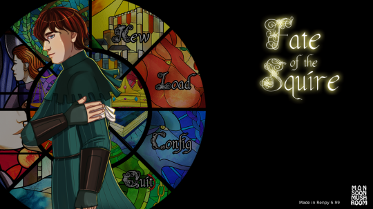
So, let’s start with the main menu. I’m pretty happy with this, I feel like it needs a bit of animation or something but the overall look is what I was going for:
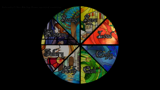
When you’re in-game, pressing esc takes you to a pause menu where you can access all the other functions:
Saving/loading currently looks like this:
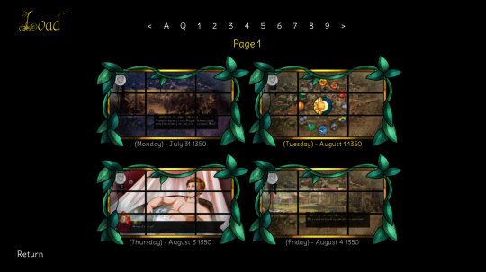
… I was trying to think of a way to makes the file slot screenshots look like windows but to be honest, it didn’t turn out as well as I’d hoped. I do plan to revisit this design later.
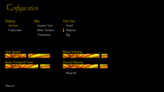
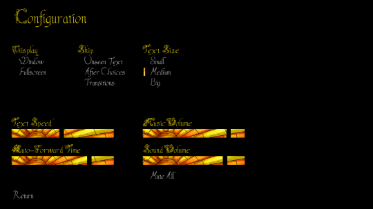
Preferences (though I changed the name to config) is pretty similar to the gui renpy ships with, since I couldn’t really come up with a better design that fit the church window theme. It’s okaaay, but a bit bland so again, this one needs revisiting later. I did add in an option to change text size, since that’s always a nice feature for a player to have:
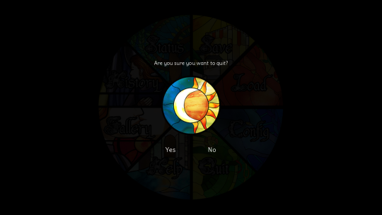
The quit option, or any confirm choice, now looks like this. The sun and moon are actually two buttons cleverly positioned together so they light up individually when hovered over, which I think looks pretty neat:
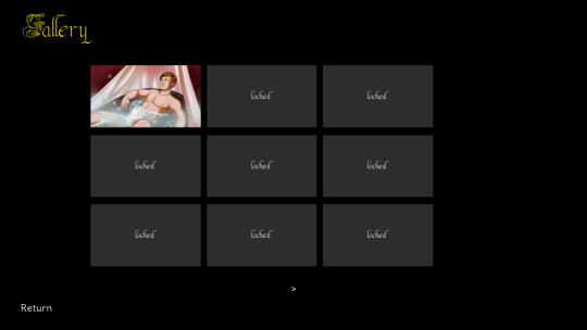
The Help and History screens are unchanged from the default; didn’t see much point in messing with those. The Gallery is a new feature so once you’ve seen a CG in-game, it’s permanently unlocked for you (even if you start a new game):
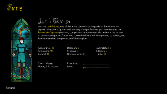
Lastly we have the Status screen, where you can check status, money, stress and relationship progress. I think it turned out well!
The astute among you may have noticed a change in font as well. I knew the font I used for names/titles didn’t work as a small font in dialogue, so I tried making a simpler version. It… didn’t work out. My attempts:
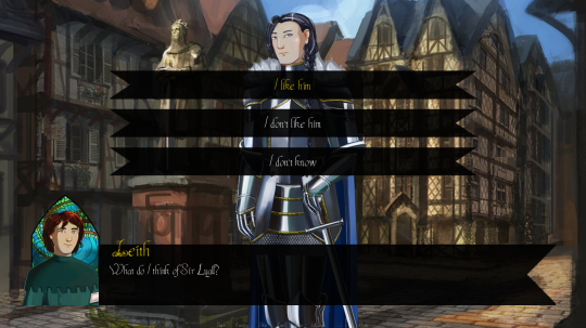
In the end, the font was just too spidery and I wasn’t willing to sink more time and effort into it, so I caved and got a nice (and commercially free) font called Delius to use instead. Comparison:
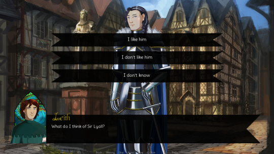
It’s still a little bit fancy, but it should be easy enough to read, I hope? If anyone disagrees please do let me know and I can look into different font options.
That’s it for September’s update. For October I’m planning to focus on finishing sprites and the CGs I need to release a demo (hopefully) at the end of November. Lots of work ahead!
Get Fate of the Squire (demo)
Fate of the Squire (demo)
A m/m dating sim about knights and squires.
| Status | On hold |
| Author | MonsoonMushroom |
| Genre | Visual Novel |
| Tags | Dating Sim, Erotic, Fantasy, LGBT, NSFW, Romance |
| Languages | English |
More posts
- AUGUST SHOWCASE - SQUIRE HIATUSAug 27, 2019
- JULY SHOWCASEJul 30, 2019
- JUNE SHOWCASEJun 25, 2019
- MAY SHOWCASEJun 04, 2019
- APRIL SHOWCASEApr 29, 2019
- MARCH SHOWCASEApr 08, 2019
- FEBRUARY SHOWCASEMar 03, 2019
- JANUARY SHOWCASEJan 28, 2019
- DECEMBER SHOWCASEJan 01, 2019
- NOVEMBER SHOWCASENov 26, 2018
Leave a comment
Log in with itch.io to leave a comment.